")
Agilemania
Agilemania, a small group of passionate Lean-Agile-DevOps consultants and trainers, is the most tru... Read more
Agilemania
Agilemania, a small group of passionate Lean-Agile-DevOps consultants and trainers, is the most tru... Read more

So you've got a data analyst interview coming up, maybe it's your first one, or maybe you've been through a few and want to feel more prepared this time. Either way, you're probably wondering, "What are they actually going to ask me?
The honest answer is that data analyst interviews cover a lot of ground. You might get questions about SQL, statistics, how you'd approach a messy dataset, or even something as broad as "Walk me through a project you've worked on." " It can feel overwhelming when you don't know where to start.
That's exactly why we put this blog together. We've collected over 40 of the most common data analyst interview questions, the kind that actually show up in real interviews—and written clear, straightforward answers for each one. Whether you're just getting started in your career or looking to move into a more senior role, there's something here for you.
You don't need to be a math genius or have years of experience to get through this. You just need to understand the core ideas, be able to explain them clearly, and know how to connect them to real-world situations. That's what interviewers are really looking for.
Work through the questions at your own pace, focus on the areas where you feel least confident, and don't just memorize the answers , try to actually understand the why behind them. That's what will make the difference when you're sitting across the table from an interviewer.
A data analyst is a professional who collects, organizes, and examines data to uncover patterns, trends, and insights that help businesses make smarter, evidence-based decisions. Think of them as translators between raw numbers and real-world business strategy.
Their day-to-day responsibilities typically include:
Data Collection — Pulling data from various sources such as databases, spreadsheets, APIs, or third-party tools
Data Cleaning — Identifying and fixing errors, inconsistencies, duplicates, or missing values before any analysis begins
Data Analysis — Applying statistical techniques to find meaningful patterns and trends in the data
Data Visualization — Presenting findings using charts, graphs, and dashboards (using tools like Tableau or Power BI) so that non-technical stakeholders can understand the story the data tells
Reporting & Communication — Preparing reports and presentations that translate analytical findings into actionable business recommendations
In terms of tools, data analysts commonly work with SQL for querying databases, Excel or Google Sheets for quick analysis, Python or R for more advanced statistical work, and visualization tools like Tableau or Power BI for dashboards.
Ultimately, the value a data analyst brings lies not just in finding patterns, but in turning those patterns into decisions that drive business outcomes.
Data analysis is an interdisciplinary branch of data science that applies mathematical, statistical, and computational techniques, combined with domain knowledge, to extract meaningful insights or patterns from data. The process encompasses gathering, cleaning, transforming, and structuring data to draw conclusions, generate forecasts, and support sound decision-making. Ultimately, data analysis converts raw, unprocessed data into actionable intelligence that can guide strategy, resolve problems, or surface hidden trends.
A wide variety of tools are available for data analysis, each carrying its own strengths and trade-offs. The most widely adopted include:
1. Spreadsheet Software—Used for sorting, filtering, summarizing, and performing built-in statistical functions:
Microsoft Excel
Google Sheets
LibreOffice Calc
2. Database Management Systems (DBMS) — Provide a secure and efficient environment for storing, managing, and querying large datasets:
MySQL, PostgreSQL, Microsoft SQL Server, Oracle Database
3. Statistical Software — Purpose-built platforms for rigorous statistical analysis:
SAS — Broadly adopted across industries for analytics and data management
SPSS — Widely used in social science research
Stata — Popular for managing, analyzing, and graphing data across various fields
4. Programming Languages — Offer flexibility and depth for custom, math-driven analysis:
R — A free, open-source language purpose-built for statistical analysis and data visualization
Python — Also free and open-source; has surged in popularity and extends into machine learning, AI, and web development
The distinction lies in how information is organized and stored.
Structured data is arranged in a defined, consistent format, typically organized into rows and columns (as in a table or spreadsheet), making it straightforward to search, sort, and query.
Unstructured data has no predefined format or organizational schema, making it considerably more difficult to search, process, and analyze without specialized tools.
|
Feature |
Structured Data |
Unstructured Data |
|
Organization |
Rigid schema with rows and columns |
No predefined structure |
|
Searchability |
Highly searchable and easy to query |
Difficult to search without preprocessing |
|
Analysis |
Easily processed using standard database operations |
Challenging to organize and analyze |
|
Storage |
Relational databases |
Data lakes |
|
Examples |
Customer records, financial data, product inventories |
Text documents, images, audio, video |
An analytics project is not just about crunching numbers; it follows a structured lifecycle from understanding the problem to delivering actionable recommendations. Here are the key stages:
1. Understand the Business Problem: Before touching any data, it is essential to clearly define what question you are trying to answer. This involves working with stakeholders to understand their goals, the decisions they need to make, and what success looks like. A poorly defined problem leads to irrelevant analysis no matter how technically sound it is.
2. Gather Relevant Data: Once the problem is defined, identify where the relevant data lives, such as databases, spreadsheets, APIs, third-party tools, surveys, or web scraping, and collect it. Ensuring the data is representative, complete, and sourced correctly is critical at this stage.
3. Clean and Explore the Data: Raw data are almost never analysis-ready. This stage involves removing errors, handling missing values, eliminating duplicates, standardizing formats, and performing Exploratory Data Analysis (EDA) to understand the dataset's structure, distributions, and any anomalies.
4. Analyze and Visualize: Apply statistical techniques, build models, or run queries to extract insights. Visualize findings with charts, graphs, and dashboards that make patterns easy to interpret for yourself and others.
5. Share Insights and Recommendations: The final and arguably most important stage: present your findings to stakeholders in a clear, concise, and non-technical format. The goal is not just to show what the data says but also to recommend actions based on evidence.
Data analysis rarely proceeds smoothly from start to finish. Analysts routinely encounter several obstacles that can significantly affect the quality and timeliness of their work:
1. Poor Quality Data: This challenge is the most pervasive. Data may contain missing values, duplicates, inconsistent formatting, or outright errors. Garbage in, garbage out; no amount of analytical sophistication can compensate for fundamentally flawed data. Data cleaning and validation often take up 60–80% of a project before any real analysis begins.
2. Confusing or Unclear Requirements: When business stakeholders don't clearly communicate what they need or change their minds mid-project, it leads to wasted effort. Analysts may spend days building a report only to discover it answers the wrong question. Regular communication and well-defined problem statements help mitigate the risk of project failure.
3. Incorrect Joins: When combining data from multiple tables or sources, using the wrong type of join (e.g., using an INNER JOIN when a LEFT JOIN was needed) can silently drop records or inflate counts, leading to subtly wrong results that are difficult to detect. This is a common source of analytical errors.
4. Data Access Limitations: Analysts frequently need data that sits behind access restrictions, resides in siloed systems, or requires special permissions to retrieve. This slows down the analytical process and sometimes makes certain analyses impossible without escalation or IT involvement.
5. Changing Business Needs: Businesses evolve, and so do their analytical requirements. Metrics that were relevant last quarter may be obsolete today. Analysts must be adaptable and willing to revisit and revise their work as organizational priorities shift — which can be particularly frustrating mid-analysis.
Data cleaning is the process of identifying and correcting (or removing) inaccurate, incomplete, or misleading records from a dataset. Its primary goal is to improve data quality so that it can reliably support analysis and predictive modeling. It typically follows data collection and loading as the immediate next step.
During data cleaning, analysts typically address the following:
Inconsistencies — Variations in formats, column names, data types, or naming conventions that complicate aggregation and comparison
Duplicate entries — Repeated records that can skew results and inflate counts or statistical summaries
Missing values — Absent data points that are either removed or imputed with estimated values
Outliers—Extreme data points that deviate significantly from the norm, potentially caused by collection errors; these must be identified and handled appropriately
Data wrangling, also referred to as data munging, is the process of cleaning, restructuring, and transforming raw, messy, or unstructured data into a form suitable for analysis or model building. The overarching objective is to raise the quality and usability of a dataset so it can support reliable, data-driven outcomes.
The most common tasks within data wrangling include:
Data Cleaning — Detecting and removing errors, inconsistencies, and missing values
Data Transformation — Adjusting the structure, format, or values of data (e.g., scaling, normalization, encoding)
Data Integration — Combining datasets from multiple sources for consolidated analysis
Data Restructuring — Reorganizing data into formats better suited for analysis, including reshaping or feature aggregation
Data Enrichment — Supplementing existing data with additional relevant information from external sources
Quality Assurance — Verifying that the data meets the required standards before analysis proceeds
Exploratory Data Analysis (EDA) is the practice of investigating and understanding a dataset through a combination of graphical and statistical methods. It is a foundational step in data analysis that helps uncover patterns, trends, and inter-variable relationships.
EDA is non-parametric; it makes no prior assumptions about the dataset. Its importance stems from several key contributions:
It enables a thorough understanding of the data's patterns, distributions, underlying nature, and relationships among variables
Through univariate techniques (e.g., mean, median, mode, quartile range, distribution plots), it supports quality assessment of individual features
Through bivariate and multivariate techniques (e.g., regression, correlation, covariance, scatter plots), it reveals relationships between two or more variables
It helps identify the most influential features in a dataset through correlation and covariance analysis
It facilitates outlier detection via box plots, enabling statistical removal of anomalies
EDA lays the groundwork for all subsequent stages of the analysis, including preprocessing, hypothesis testing, modeling, and interpretation, leading to more accurate and actionable conclusions.
Python offers a rich ecosystem of libraries purpose-built for data analysis. The most widely used include:
NumPy—The foundational library for numerical computing; supports arrays, matrices, and mathematical operations
Pandas — The go-to library for data manipulation and analysis; provides powerful DataFrames for filtering, aggregating, and transforming structured data
SciPy — A scientific computing library offering extensive functions for statistical and mathematical analysis
Matplotlib — The primary Python library for creating plots and visualizations
Seaborn — A higher-level visualization library built on Matplotlib with a more intuitive interface for statistical plots
Scikit-learn — A comprehensive machine learning library covering classification, regression, clustering, and model evaluation
Statsmodels — Focused on statistical model estimation and inference, supporting linear models and time series analysis
Not sure if you’re truly ready for your exam? Before any exam, it’s always better to check whether you’re prepared or not. You can do that with our assessments, designed by industry experts with 25+ years of experience. Once you complete it, you’ll clearly see where you stand and what needs attention. Over 1000 people have used these assessments and cleared their exams on the first attempt.
Take Test Now!
Accordion body...
Both WHERE and HAVING are used to filter data in SQL, but they operate at different stages of query execution and serve distinct purposes.
WHERE is applied before any grouping occurs. It filters individual rows from the raw table based on specified conditions. Only the rows that pass the WHERE filter are passed into the GROUP BY operation.
HAVING is applied after grouping. It filters the results of an aggregation, meaning it works on grouped data and can reference aggregate functions like SUM(), COUNT(), AVG(), etc.
Example to illustrate the difference:
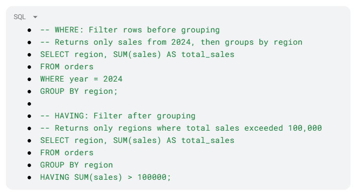
Key rule to remember: If you need to filter on a raw column value, use WHERE. If you need to filter based on the result of an aggregate function, use HAVING. They can also be used together in the same query.
JOINs in SQL are used to combine rows from two or more tables based on a related column. The type of JOIN determines which records are included in the result.
INNER JOIN returns only the rows where there is a matching record in both tables. If a record in the left table has no corresponding match in the right table (or vice versa), it is excluded from the results entirely.
LEFT JOIN (also called LEFT OUTER JOIN) returns all rows from the left table, along with any matching rows from the right table. Where there is no match in the right table, the columns from the right table appear as NULL.
Example:
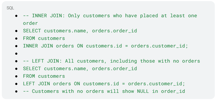
When to use which:
Use INNER JOIN when you only want records that exist in both tables
Use LEFT JOIN when you want to keep all records from the left table, regardless of whether a match exists in the right table, useful for finding gaps (e.g., customers who have never ordered)
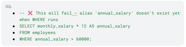
No, you cannot use a column alias defined in the SELECT clause within the WHERE clause of the same query. This is because of the logical order of SQL query execution, which differs from the written order.
SQL processes clauses in this sequence:
FROM
WHERE
GROUP BY
HAVING
SELECT
ORDER BY
Since WHERE is evaluated before SELECT, the alias has not yet been created at the time the WHERE filter runs. Attempting to reference it will result in an error.
Example of what NOT to do:
Correct approaches:
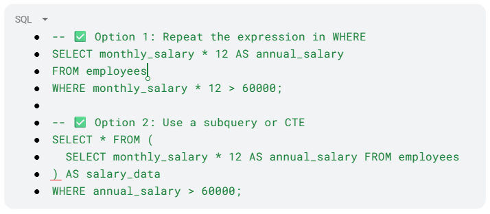
Note: Aliases can be used in ORDER BY because ORDER BY is evaluated after SELECT.
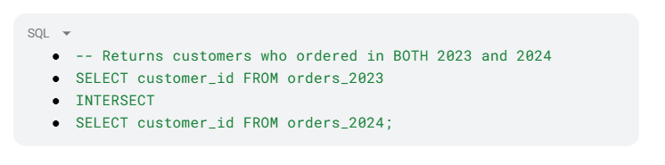
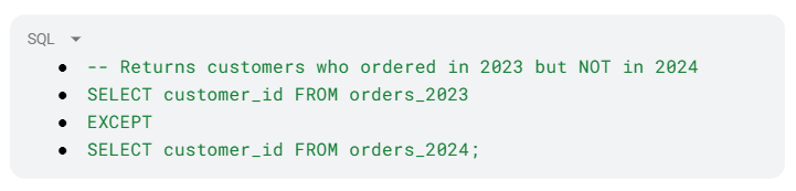
These three SQL set operators are used to combine the results of two or more SELECT statements. Each one handles the combination differently:
UNION combines the result sets of two queries and returns all unique rows from both. Use UNION ALL if you want to include duplicates.
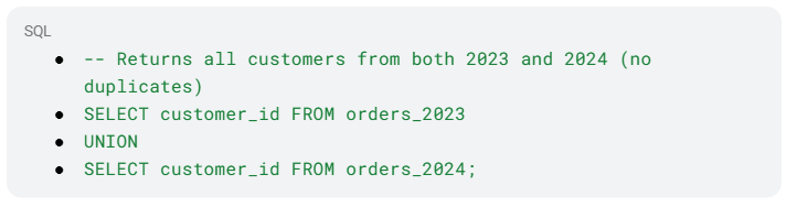
INTERSECT returns only the rows that appear in both result sets, essentially the overlap between the two queries.
EXCEPT (called MINUS in some databases, like Oracle) returns rows from the first query that do not appear in the second query, essentially the difference.
 .
.
Important rule: All queries combined with these operators must have the same number of columns with compatible data types.
|
Operator |
What it Returns |
|
UNION |
All rows from both queries (removes duplicates) |
|
INTERSECT |
Only rows that exist in both queries |
|
EXCEPT |
Rows in the first query that don't appear in the second |
Both correlated and non-correlated subqueries are queries nested inside a larger (outer) query, but they differ fundamentally in how they execute and whether they depend on the outer query.
A non-correlated subquery is completely independent of the outer query. It runs once, produces a result, and that result is then used by the outer query. Because it only executes once, it is generally more efficient.
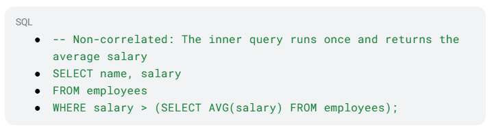
Correlated Subquery references a column from the outer query, which means it cannot run independently. It is re-executed once for every row processed by the outer query, making it significantly slower on large datasets.
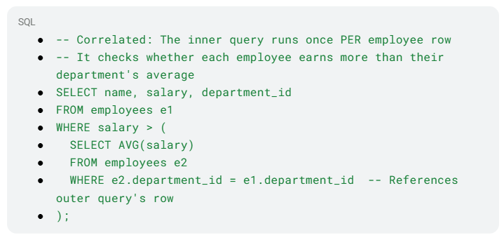
When to use which:
Prefer non-correlated subqueries when possible, as they execute only once
Use correlated subqueries when the inner query's logic must depend on each individual row of the outer query
For performance on large datasets, consider rewriting correlated subqueries using JOINs or CTEs
All three are SQL window functions used to assign a ranking to rows within a result set, but they handle ties differently — and that difference matters significantly in practice.
ROW_NUMBER() assigns a completely unique sequential number to every row, regardless of ties. Even if two rows have identical values, they receive different numbers. The order of assignment among tied rows is arbitrary unless a secondary sort column is specified.
RANK() assigns the same rank to tied rows but then skips the next rank(s) to account for the tie. For example, if two rows tie for rank 1, the next row is ranked 3 (not 2).
DENSE_RANK() also assigns the same rank to tied rows, but unlike RANK, it does not skip any numbers. The next rank after a tie always continues consecutively.
Example:

|
Name |
Score |
ROW_NUMBER |
RANK |
DENSE_RANK |
|
Alice |
95 |
1 |
1 |
1 |
|
Bob |
90 |
2 |
2 |
2 |
|
Carol |
90 |
3 |
2 |
2 |
|
Dave |
85 |
4 |
4 |
3 |
Notice: RANK skips 3 after the tie at position 2, while DENSE_RANK moves directly to 3.
Use cases:
ROW_NUMBER — When you need a unique identifier for every row (e.g., pagination)
RANK — When you want to reflect actual competition gaps (e.g., sports leaderboards)
DENSE_RANK — When you want rankings without gaps, especially for finding the Nth highest value
A Common Table Expression (CTE) is a named, temporary result set that you define at the beginning of a SQL query and can reference within that same query. It exists only for the duration of the query's execution, it is not stored as a physical object in the database.
CTEs are defined using the WITH keyword followed by a name and the query that populates it:

Why use CTEs?
Readability — Breaking complex queries into named, logical steps makes them far easier to read and understand than deeply nested subqueries
Reusability within the query—The same CTE can be referenced multiple times within a single query, avoiding repetition
Debugging—Each CTE can be tested independently, making it easier to isolate issues in complex queries
Recursive queries—CTEs support recursion, enabling queries that traverse hierarchical data (e.g., org charts, folder structures)
CTEs vs. Subqueries: Both achieve similar results, but CTEs are generally preferred for complex logic because they are defined once at the top and referenced by name, whereas subqueries are embedded inline and can become difficult to read when nested deeply.
A window function is a type of SQL function that performs a calculation across a defined set of rows, called a "window", that are related to the current row. Unlike aggregate functions (which collapse rows into a single summary result), window functions retain all individual rows in the output while adding a computed value alongside each one.
They are defined using the OVER() clause, which specifies how the window of rows is partitioned and ordered.

Key components of the OVER() clause:
PARTITION BY—Divides rows into groups (similar to GROUP BY); the function resets for each partition
ORDER BY — Defines the order of rows within each partition
Frame clause (optional)—Defines the subset of rows relative to the current row (e.g., ROWS BETWEEN 3 PRECEDING AND CURRENT ROW)
|
Function |
Purpose |
|
ROW_NUMBER() |
Assigns a unique sequential number to each row |
|
RANK() / DENSE_RANK() |
Assigns ranks with or without gaps |
|
SUM() / AVG() |
Running or cumulative totals/averages |
|
LAG() / LEAD() |
Accesses the value of the previous or next row |
|
FIRST_VALUE() / LAST_VALUE() |
Returns the first or last value in the window |
Window functions are powerful for tasks like running totals, moving averages, percentile calculations, and comparing each row to others in the same group, without collapsing the dataset.
A stored procedure is a pre-compiled, named collection of one or more SQL statements that is saved directly in the database and can be executed on demand. Think of it as a reusable SQL program; you write it once, store it in the database, and call it whenever needed without rewriting the logic.
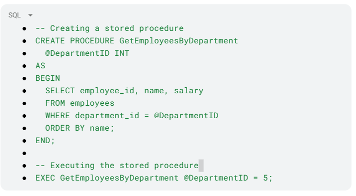
Key advantages of stored procedures:
Reusability — Once written, the procedure can be called repeatedly with different parameters, eliminating redundant code
Performance—Stored procedures are pre-compiled and cached by the database engine, making repeated executions faster than equivalent ad-hoc queries
Security—Users can be granted permission to execute a procedure without having direct access to the underlying tables, adding a layer of data security
Maintainability — Business logic is centralized in the database. If the logic needs to change, you update the procedure in one place rather than across multiple applications
Reduced network traffic—Instead of sending multiple SQL statements from an application to the database, a single call to the procedure handles everything server-side
Stored procedures can accept input parameters, return output parameters, and execute conditional logic — making them powerful tools for encapsulating complex database operations.
Finding the Nth highest value is a classic SQL interview problem. The cleanest and most reliable approach in modern SQL is to use the DENSE_RANK() window function, which handles tied values correctly and avoids gaps in ranking.
Using DENSE_RANK() — Recommended Approach:.
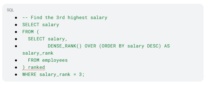
Why DENSE_RANK over RANK? If two employees share the 2nd highest salary, RANK() would skip rank 3 and jump to 4. DENSE_RANK() continues consecutively, so rank 3 always means the 3rd distinct value — which is almost always the intended behavior.
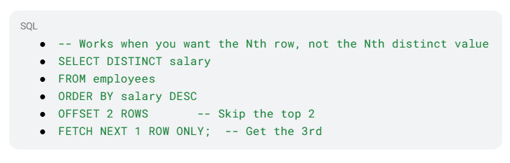
Alternative using OFFSET-FETCH (simpler for distinct values):
Alternative using a subquery (older SQL compatibility):
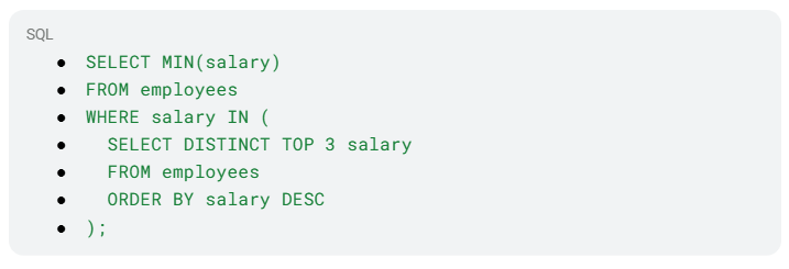
The DENSE_RANK() approach is generally preferred, as it is readable, handles ties gracefully, and works across most modern SQL databases.
Recruiters check LinkedIn before resumes. A weak profile can cost opportunities. Don’t worry. Agilemania’s new AI Resume Review tool analyzes your resume, gives a score, and highlights improvements for skills, keywords, and impact. Strengthen your LinkedIn presence with a resume that aligns with hiring expectations and increases chances of interviews.
Contact Us
Measures of central tendency are statistical values that represent the center or typical value of a dataset, the point around which most observations tend to cluster. The three principal measures are the following:
Mean: the arithmetic average, calculated by summing all values and dividing by the total count. It is sensitive to outliers since extreme values can pull the mean significantly.
Mean = (Sum of all values) / (Total number of values)
Median: The middle value when data is arranged in ascending or descending order. When the dataset has an even number of values, the median is the average of the two central values. It is more robust to outliers than the mean.
Mode: The value that appears most frequently in a dataset. A dataset may have no mode or multiple modes. Especially useful for categorical data and discrete distributions.
Measures of dispersion quantify how much the values in a dataset deviate from the central value. Common measures include:
Range — Difference between the highest and lowest values; sensitive to extremes
Variance — Average of the squared deviations from the mean: σ² = Σ(X − μ)² / N
Standard Deviation — Square root of the variance; expressed in the same units as the original data
Mean Absolute Deviation (MAD) — Average of absolute differences from the mean; less sensitive to outliers than variance
Percentiles — Values that indicate the relative position of a data point within a distribution
Interquartile Range (IQR) — Range between Q1 (25th percentile) and Q3 (75th percentile); captures the middle 50% of data and is resistant to outliers
Coefficient of Variation (CV) — Ratio of standard deviation to mean, expressed as a percentage; useful for comparing variability across datasets with different units
Both variance and covariance are statistical measures related to the spread and relationship of data, but they serve different purposes and describe different things.
Variance measures how much a single variable spreads around its mean. It quantifies the internal variability of one dataset. A high variance means the data points are widely scattered; a low variance means they cluster closely around the mean.
Variance (σ²) = Σ(X − μ)² / N
Covariance measures how two variables change together. It indicates the direction of the linear relationship between them. A positive covariance means both variables tend to increase together; a negative covariance means one tends to increase as the other decreases; a covariance near zero suggests little to no linear relationship.
Covariance (X, Y) = Σ[(Xᵢ − μX)(Yᵢ − μY)] / N
Key limitation of covariance: Its value depends on the units and scale of the variables, making it difficult to interpret in isolation or compare across different datasets. This is why covariance is often normalized into the correlation coefficient (which ranges from -1 to +1), providing a scale-independent measure of the relationship's strength and direction.
|
Aspect |
Variance |
Covariance |
|
Variables involved |
One |
Two |
|
What it measures |
Spread of a single variable |
Direction of relationship between two variables |
|
Value range |
Always ≥ 0 |
Can be positive, negative, or zero |
|
Unit dependency |
Yes (squared units) |
Yes (product of both units) |
Correlation and causation are two concepts that are frequently confused, even in professional settings. Understanding the distinction is fundamental to sound data analysis and avoiding misleading conclusions.
"Correlation" describes a statistical relationship between two variables: when one changes, the other tends to change as well. Correlations can be positive (both increase together), negative (one increases as the other decreases), or close to zero (no meaningful linear relationship). It is measured by the correlation coefficient (r), which ranges from -1 to +1.
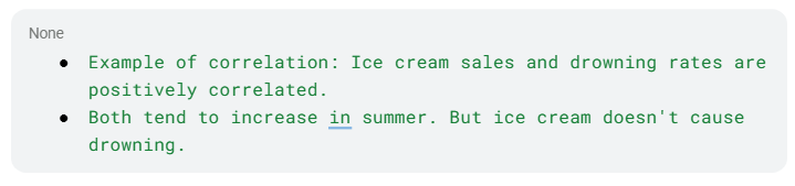
Causation (or causality) means that a change in one variable directly produces a change in another. Establishing causation requires more than observing a correlation — it typically requires controlled experiments, temporal ordering (the cause must precede the effect), and the elimination of confounding variables.
Why the distinction matters in data analysis:
When two variables are correlated, there are multiple possible explanations:
A causes B
B causes A
A third variable C causes both A and B (confounding)
The correlation is purely coincidental (spurious correlation)
A famous example: Countries with more TVs per household tend to have longer life expectancies. Does TV cause longevity? No — both are driven by a third variable: wealth. Wealthier countries can afford more TVs and better healthcare.
In practice: Data analysts must be careful not to imply causal relationships from observational data alone. Phrases like "X is associated with Y" are appropriate; "X causes Y" requires much stronger evidence, typically from a controlled experiment or rigorous causal inference methods.
A probability distribution is a mathematical function that describes the likelihood of each possible outcome in a random experiment. It maps outcomes in a sample space to their associated probabilities.
Discrete Probability Distributions — For random variables that take on distinct, countable values. Examples: binomial, Poisson, and hypergeometric distributions.
Continuous Probability Distributions — For random variables that can take any value within a continuous range. These are described by probability density functions (PDFs). Examples: normal, exponential, and uniform distributions.
A normal distribution, also known as a Gaussian distribution, is a continuous probability distribution characterized by its symmetric, bell-shaped curve. Data clusters around a central mean, with the majority of observations falling within one standard deviation of that mean. The curve tapers gradually toward both ends, indicating that extreme values become progressively less likely.
A special case, the standard normal distribution, has a mean of 0 and a standard deviation of 1. Z-scores are used to express how many standard deviations a particular data point lies from the mean.
The normal distribution is foundational in statistics, underpinning many analytical methods, including hypothesis testing, regression, and confidence intervals.
The Central Limit Theorem (CLT) states that, under certain conditions, the distribution of sample means will approximate a normal distribution as sample size increases, regardless of the shape of the original population distribution.
The CLT rests on three key assumptions:
1. Independence—Samples must be drawn independently
2. Randomness—Every member of the population must have an equal chance of selection
3. Sufficient sample size — The theorem generally applies when the sample size exceeds 30
Descriptive statistics summarize and describe the key characteristics of a dataset, central tendency, variability, and distribution, without generalizing beyond the observed data.
Example questions: What is the average salary of a data analyst? What is the income range? How are salaries distributed?
Inferential statistics draws conclusions, makes predictions, and generalizes findings from a sample to a broader population using hypothesis testing, confidence intervals, and regression analysis.
Example questions: Is there a meaningful salary difference between data analysts and data scientists? Can salary be predicted based on years of experience?
In statistical hypothesis testing, these are two mutually exclusive claims about a population parameter:
Null Hypothesis (H₀) — Represents the default position or status quo: that there is no difference, effect, or relationship. It is assumed to be true unless compelling evidence suggests otherwise.
Alternative Hypothesis (Hₐ or H₁) — Challenges the status quo by asserting that a difference or effect does exist. This is what the researcher is attempting to support.
A p-value represents the probability of observing the collected data — or results even more extreme — assuming the null hypothesis is true. A smaller p-value indicates stronger evidence against the null hypothesis.
p ≤ α (significance level): Reject the null hypothesis — results are statistically significant
p > α: Fail to reject the null hypothesis — insufficient evidence to support the alternative
The significance level, commonly denoted as α (alpha), is a predefined threshold used in hypothesis testing to determine when results are considered statistically significant. Common values are 0.05, 0.01, and 0.10.
Selecting a significance level involves a trade-off:
A lower α (e.g., 0.01) reduces false positives but increases the chance of missing a real effect
A higher α (e.g., 0.10) reduces missed effects but increases the chance of false positives
|
Error Type |
Definition |
Also Known As |
Symbol |
|
Type I |
Rejecting a true null hypothesis |
False Positive |
α |
|
Type II |
Failing to reject a false null hypothesis |
False Negative |
β |
Type I example: Concluding a new medication works when it actually has no effect. Type II example: Concluding a medication has no effect when it actually does work.
|
Feature |
Data Analyst |
Data Scientist |
|
Core Skills |
Excel, SQL, Python, R, Tableau, Power BI |
Machine Learning, Statistical Modeling, Docker, Software Engineering |
|
Key Tasks |
Data collection, cleaning, visualization, EDA, reporting |
Database management, ML model development and deployment, task automation |
|
Focus |
Describing and explaining what happened |
Predicting what will happen |
|
Seniority Level |
Typically entry-level |
Typically senior-level |
Data analysts concentrate on collecting, cleaning, and interpreting data to help organizations make better-informed decisions.
Data scientists design and deploy machine learning and statistical models that enable prediction, process automation, and operational improvement.
|
Similarities |
Differences |
|
Both use data to improve decision-making |
Data analysis is more technical; BI is more strategic |
|
Both involve collecting, cleaning, and transforming data |
Data analysis uncovers patterns; BI delivers business-relevant information |
|
Both use visualization tools to present findings |
Data analysis answers specific questions; BI supports broader organizational decisions |
Descriptive analysis addresses "What happened in the past?" It identifies existing patterns, trends, and relationships using statistical summaries, visualizations, and exploratory techniques.
Predictive analysis applies historical data through statistical and machine learning models to forecast future outcomes. It involves model building, feature selection, and validation on unseen data and supports forward-looking decision-making.
Univariate Analysis — Examines a single variable in isolation: its distribution, central tendency, and spread. Common techniques: histograms, box plots, summary statistics.
Bivariate Analysis—Explores the relationship between two variables, whether a relationship exists, how strong it is, and whether one can predict the other. Common techniques: scatter plots, correlation analysis, cross-tabulations.
Multivariate Analysis — Examines relationships among three or more variables simultaneously to detect patterns, clusters, and dependencies. Common techniques: PCA, factor analysis, cluster analysis, multiple regression.
Time series analysis examines data collected at successive, equally spaced time intervals to understand underlying patterns, trends, and behaviors, and to forecast future values. Key components:
Trend — Long-term direction (upward, downward, or flat)
Seasonality — Repeating patterns at regular intervals (daily, monthly, yearly)
Cyclical Patterns — Longer-term fluctuations linked to economic or business cycles
Irregular Fluctuations — Random, unpredictable variations
Autocorrelations — The relationship between a data point and its earlier values
Common techniques: moving averages, exponential smoothing, decomposition, and forecasting models such as ARIMA and SARIMA.
Feature engineering is the process of selecting, transforming, and creating input variables from raw data to improve the performance of machine learning models. Key activities:
Feature Selection — Identifying the most relevant variables through correlation analysis
Feature Creation — Generating new variables by aggregating or transforming existing ones
Transformation—Rescaling features using Min-Max Scaling, Z-Score Normalization, or log transformations
Feature Encoding—Converting categorical variables into numerical representations (One-Hot Encoding, Ordinal Label Encoding)
Data normalization rescales numerical features into a standardized range so that variables with different units or magnitudes contribute equally to models and analyses. Common normalization techniques:
Min-Max Scaling: (x - min) / (max - min) → range [0, 1]
Z-Score Normalization: (x - mean) / standard_deviation → mean 0, std 1
Robust Scaling: (X - Median) / IQR → resistant to outliers
Unit Vector Scaling: X / ||X|| → Euclidean norm of 1
One-hot encoding converts categorical variables into binary numerical representations that machine learning algorithms can process. For each unique category value, a new binary column is created — assigned 1 if that category is present for a given record, and 0 otherwise.
Example: A "color" column with values "red," "green," and "blue" becomes three columns: color_red, color_green, color_blue — with exactly one 1 per row.
A boxplot graphically summarizes a dataset's distribution using its five-number summary: minimum, Q1, median, Q3, and maximum. It provides a quick visual snapshot of spread, central tendency, and skewness.
In data science, box plots are particularly valuable for detecting outliers, data points that fall well outside the typical range (typically beyond 1.5 × IQR from Q1 or Q3). They make it easy to spot anomalies that might distort analysis or model performance.
Overfitting and underfitting are fundamental machine learning challenges that lead to poor predictive performance, albeit for opposite reasons.
Overfitting occurs when a model learns the training data too well, including its noise and random fluctuations, to the point where it fails to generalize to new, unseen data. An overfitted model performs exceptionally on training data but performs poorly on test data. It has essentially memorized the training set rather than learning the underlying patterns.
Signs of overfitting:
Very high training accuracy, significantly lower test accuracy
Model is overly complex (too many parameters relative to the data)
Common causes: Too many features, too deep a decision tree, training for too many epochs, insufficient training data
Remedies: Regularization (L1/L2), cross-validation, pruning, dropout (in neural networks), collecting more data, simplifying the model
Underfitting occurs when a model is too simple to capture the underlying patterns in the data. It performs poorly on both training and test data because it hasn't learned enough from the training set.
Signs of underfitting:
Low accuracy on both training and test data
The model's predictions are consistently off
Common causes: Model is too simple, too few features, insufficient training time, excessive regularization
Remedies: Use a more complex model, add more relevant features, reduce regularization, train for more iterations
The Bias-Variance Trade-off:
Underfitting is associated with high bias, the model makes strong, oversimplified assumptions
Overfitting is associated with high variance, the model is too sensitive to fluctuations in training data
The goal is to find the sweet spot: a model that is complex enough to capture real patterns but simple enough to generalize well
|
Aspect |
Underfitting |
Overfitting |
|
Training performance |
Poor |
Excellent |
|
Test performance |
Poor |
Poor |
|
Model complexity |
Too simple |
Too complex |
|
Associated problem |
High bias |
High variance |
|
Solution |
Increase complexity |
Reduce complexity / regularize |
AI adoption in analytics is no longer optional, over 75% of analysts now rely on AI tools for faster insights and automation. Without these skills, staying competitive is becoming harder each year. The PSM AI course focuses on practical, real-world applications that employers actually value. Learn how to work smarter with AI and improve your output. Waiting longer only widens the skill gap. Enroll now and keep your career aligned with industry demand.
Enroll Now!
Securing a data analyst internship as a fresher can be your first step into the world of data analytics.
The answer for this trending question is that while AI can automate tasks, it can't replace the strategic thinking, contextual understanding and ethical judgment that analysts bring.
The role of a data analyst has become central to modern business operations. Unlike some roles that are vulnerable to economic shifts, analytics positions often remain in demand because companies depend on data even during downturns.
In 2026, the average salary for a Data Analyst in India is roughly ₹6.3 LPA to ₹7 LPA. This figure reflects the broad market and includes data from industry salary reports and job listings.
Agilemania, a small group of passionate Lean-Agile-DevOps consultants and trainers, is the most trusted brand for digital transformations in South and South-East Asia.
WhatsApp Us

")
 Interview Questions and Answers")


